


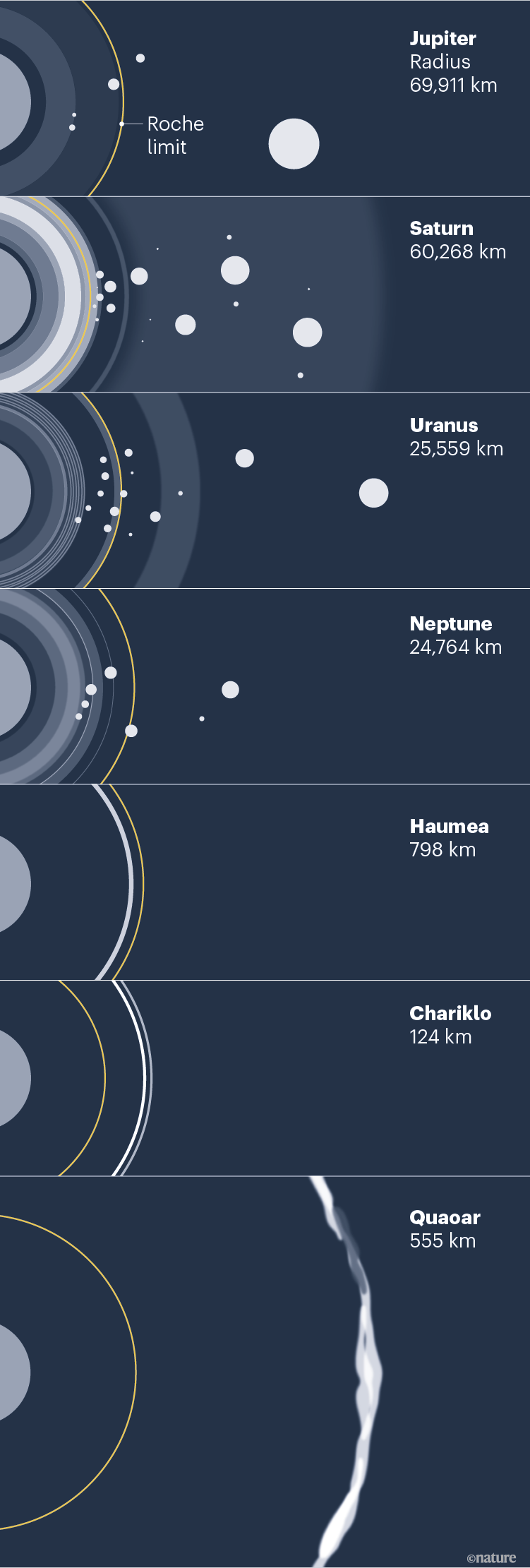
A surprising planetary ring
This beautiful graphic explains and compares planetary rings: disks containing small chunks of ice and other materials that orbit a larger object. Rings tend to be found within a critical distance of their host known as the Roche limit — the distance at which the gravitational field tends to prevent material in orbit from aggregating into moons. Most of the rings around the giant planets (Saturn, Jupiter, Uranus and Neptune) are within this limit, and the rings of Chariklo and Haumea (objects in the outer Solar System) are close to the limit.
But a paper in Nature now reports the discovery of a ring that doesn’t follow this rule. The ring around Quaoar, another object in the outer Solar System, lies far outside the Roche limit, posing a challenge for standard models of planetary rings.
Diseases in decline
The world is slowly making progress in eliminating neglected tropical diseases (NTDs), according to a report by the World Health Organization. NTDs are a group of around 20 conditions that affect more than one billion people worldwide. Treating populations with preventive medication is effective at tackling diseases such as lymphatic filariasis (also called elephantiasis); improving water, sanitation and hygiene can help to curb waterborne diseases.
WHO Global Report on Neglected Tropical Diseases 2023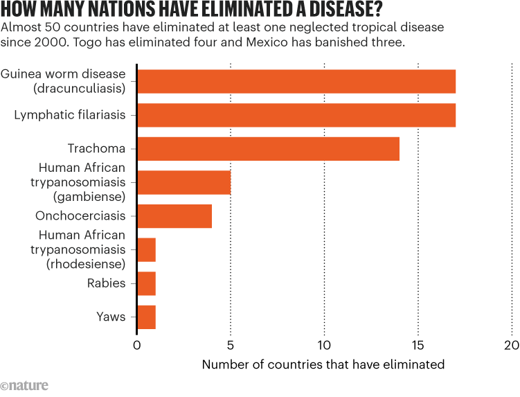
How indoor pollution is changing
Indoor air pollution is a major public-health problem, and this graph shows how sources of pollutants are changing in England. Emissions of volatile organic compounds from cosmetics and personal-care products have risen, as have pollutants associated with wood burning — which is now popular. Levels of some other pollutants, meanwhile, have declined. But much too little is known about the diverse pollutants in indoor air.
Sources: English Housing Survey 2020–2021. https://go.nature.com/4tljhzj; UK National Atmospheric Emissions Inventory. (Data and analysis courtesy Shona E. Wilde (Univ. York) & Tim Murrells (Ricardo Energy and Environment))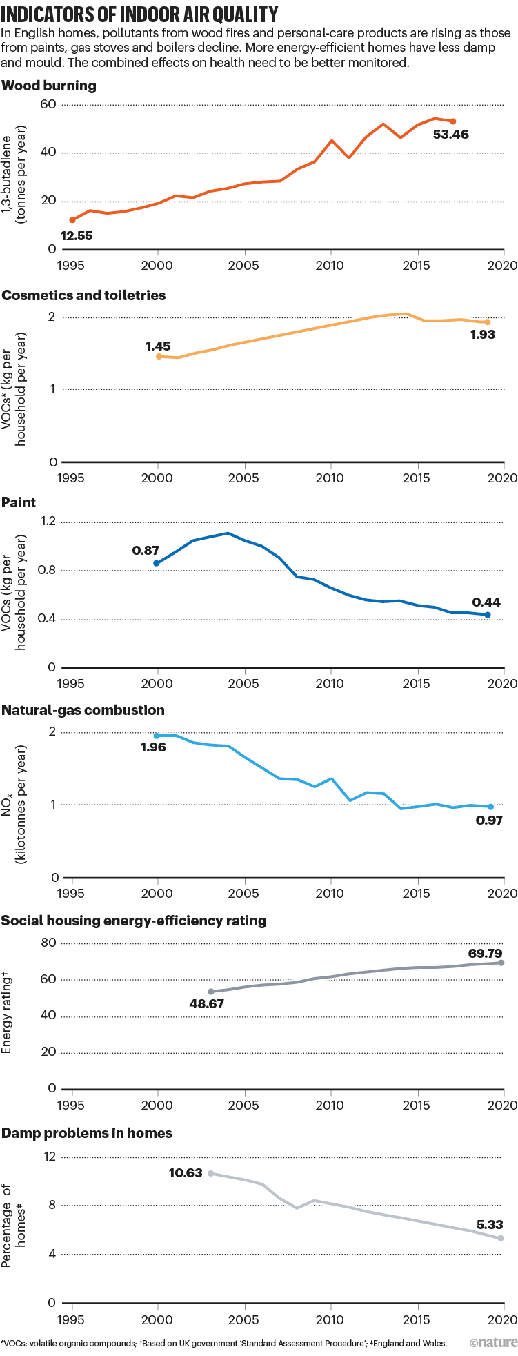
More News
US funders to tighten oversight of controversial ‘gain-of-function’ research
Bird flu in US cows: where will it end?
Daily briefing: Why exercise is good for us